Label-free phospho data
For the here shown use case Perseus 1.5.1.6 was used.
1 Dataset
The label-free phosphoproteomics data for the here shown example was published in 2014 by Sharma et al.1
This is label-free data for phosphorylation sites with six replicates of a control condition (C1,…,C6) and four replicates each of two treatments (E15_1,…,E15_4 and N1,…,N4).
The suffixes _1, _2 and _3 indicate data for the same sample and site derived from singly, double and triply or higher phosphorylated peptides.
(The file “PhosphoExample_01.raw” was processed using MaxQuant version 1.5.2.0 and analyzed using Perseus version 1.5.1.6)
2 Data preparation
2.1 Loading
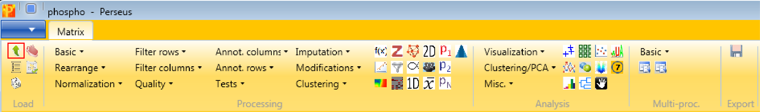
Load the file “Phospho (STY)Sites.txt” from the “combined/txt” folder of the MaxQuant output. Load → Generic matrix upload is denoted by the green arrow on the top left corner of the Perseus window or load the file using the drag and drop function of Perseus.
Make sure to load the following 42 columns as main columns:
- Intensity C1_1, Intensity C1_2, Intensity C1_3,
- Intensity C2_1, Intensity C2_2, Intensity C2_3,
- Intensity C3_1, Intensity C3_2, Intensity C3_3,
- Intensity C4_1, Intensity C4_2, Intensity C4_3,
- Intensity C5_1, Intensity C5_2, Intensity C5_3,
- Intensity C6_1, Intensity C6_2, Intensity C6_3,
- Intensity E15_1_1, Intensity E15_1_2, Intensity E15_1_3,
- Intensity E15_2_1, Intensity E15_2_2, Intensity E15_2_3,
- Intensity E15_3_1, Intensity E15_3_2, Intensity E15_3_3,
- Intensity E15_4_1, Intensity E15_4_2, Intensity E15_4_3,
- Intensity N1_1, Intensity N1_2, Intensity N1_3,
- Intensity N2_1, Intensity N2_2, Intensity N2_3,
- Intensity N3_1, Intensity N3_2, Intensity N3_3,
- Intensity N4_1, Intensity N4_2, Intensity N4_3
Also make sure that the “Localization prob” is loaded as numerical column. (Only the global one, not one for each sample.)
Comment: After each applied operation a new matrix will be generated. Every matrix that you are creating can be saved with Export → Generic matrix export and re-imported later with Load → Generic matrix upload.
3 Filtering
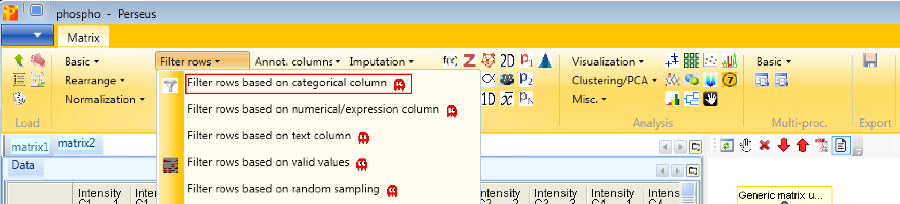
After loading the matrix, we filter out the reverse (decoy) database hits, the contaminants and the proteins with a localization probability \(<0.75\). Both the “Reverse” column and the “Contaminant” column are categorical. Therefore we use Processing → Filter rows → Filter rows based on categorical column.
First, we filter out the reverse hits. Reverse hits are indicated by a “+” in the “Reverse” column, so to filter out these hits all rows containing a “+” will be removed from the matrix. To do so the column “Reverse” needs to be selected, “+” is the value we are looking for and is selected by default. No further changes are necessary, because we want to remove the matching rows from the matrix. This results in a matrix, where the value in the “Reverse” column of all rows is empty.

Then, we filter out the contaminants. Contaminants are indicated by a “+” in the “Contaminant” column, so to filter out these hits all rows containing a “+” will be removed from the matrix. To do so the column “Contaminant” needs to be selected, “+” is the value we are looking for and is selected by default. No further changes are necessary, because we want to remove the matching rows from the matrix. This results in a matrix, where the value in the “Contaminant” column of all rows are empty.

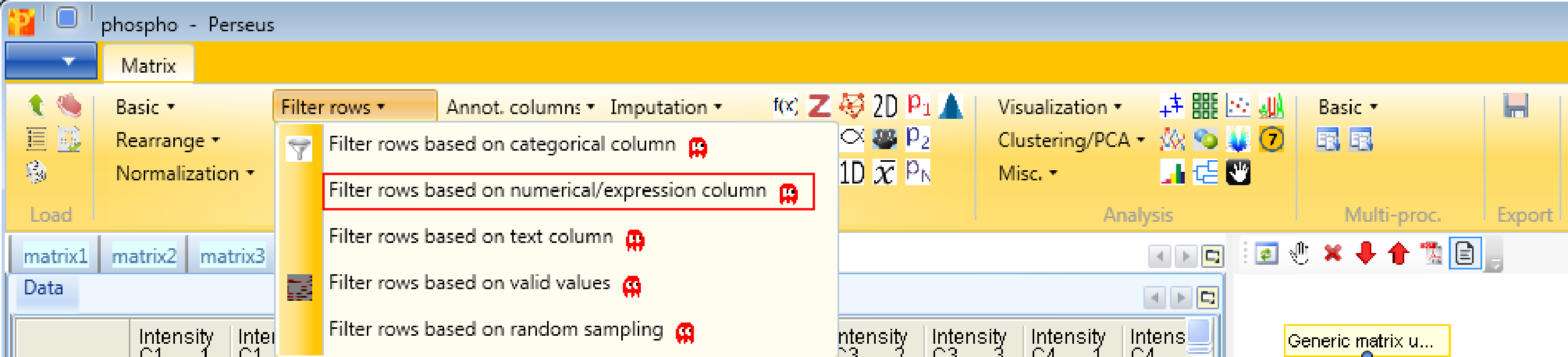
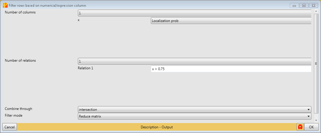
Then we filter the site table to retain only these sites that have a localization probability \(>0.75\). Therefore we use Processing → Filter rows → Filter rows based on numerical/main column.
For that filtering process we are just using the “Localization probability” column, one relation and have to specify the relation as shown in the screenshot below.
4 Transformation
Now we want to rearrange the main data. Currently, the different number of phosphorylations per peptide are formatted as separate columns. We want to have only one column per sample, and three rows per site instead. This is accomplished by Processing → Modifications → Expand site table. The function has no parameters.
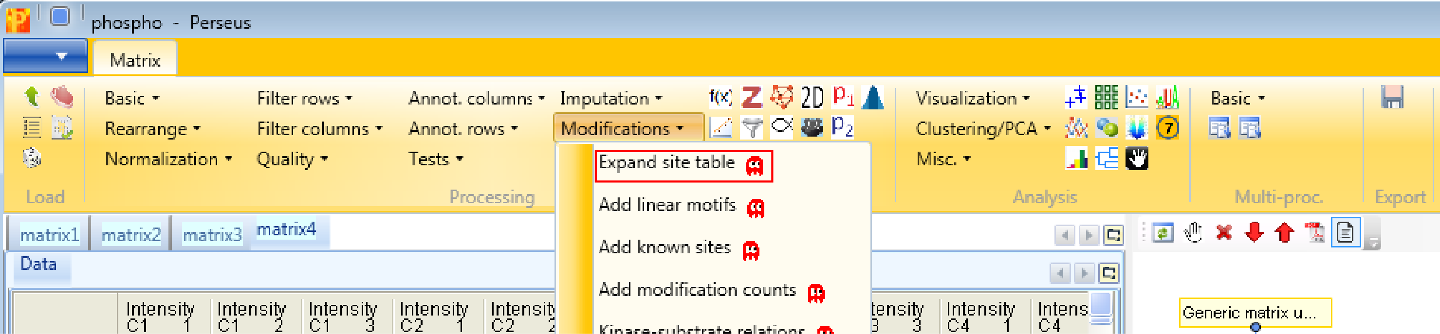
If you check the number of rows and the number of main columns in the two matrices before and after this step, you can see that the number of rows are tripled, whereas the number of main columns is one third. Also a categorical column called “Multiplicity” is generated, which contains information about the phosphorylation of the peptides (single, double, triply phosphorylated).
Now we proceed with the standard data processing steps and take the logarithm of values in the main columns with Processing → Basic → Transform.
![]()
Since the default formula is \(log_2(x)\) and all main columns are selected, nothing needs to be changed.
![]()
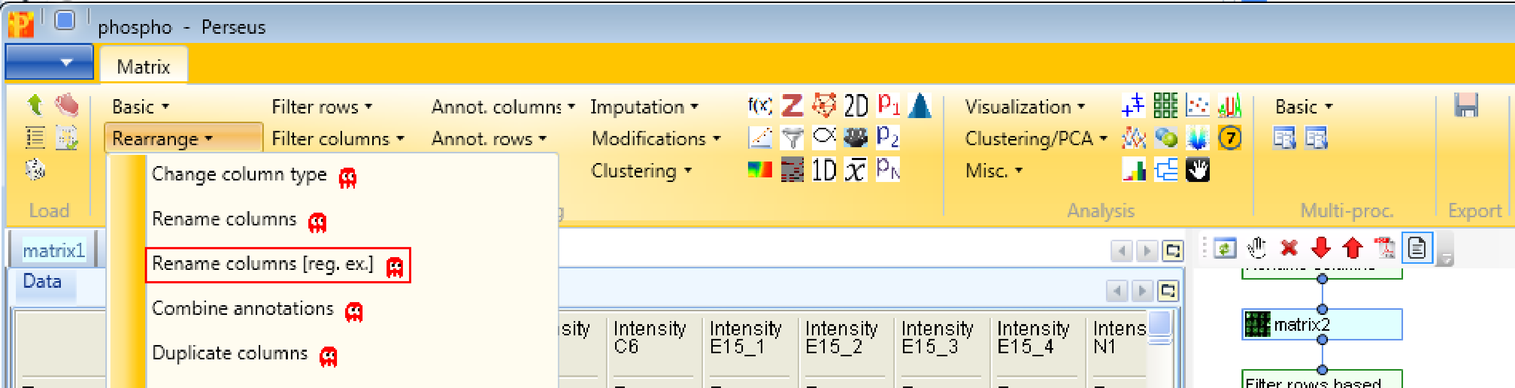
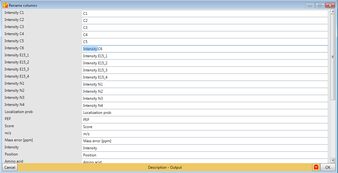
4.1 Renaming columns
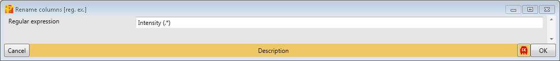
Next, we are doing some cosmetics by shortening the names of the main columns and remove the prefix “Intensity” with Processing → Rearrange → Rename columns [reg. ex.].
The regular expression that you may use to remove the repetitive part of the name is “Intensity (.*)”. The general concept of regular expressions can be found under http://en.wikipedia.org/wiki/Regular_expression. If you already know generally how regular expressions work, you may only need to glance at this Quick Reference or at an even quicker Cheat Sheet. This results in a matrix, where the names of the main columns are the replica.
If you want to rename the columns manually without the help of regular expressions you can use Processing → Rearrange → Rename columns.
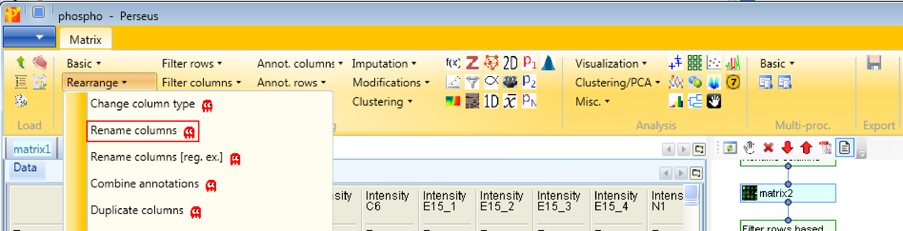
Then you can type the new names in the predefined text field.
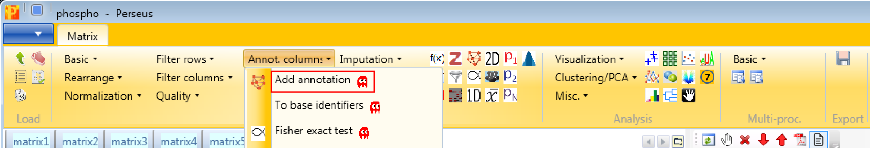
5 Add annotation
Now we add protein annotations with Processing → Annot. columns → Add annotation. There are several options for adding annotations to your data. You can select from any annotation file that is present in the “Perseus/conf/annotations/” folder.
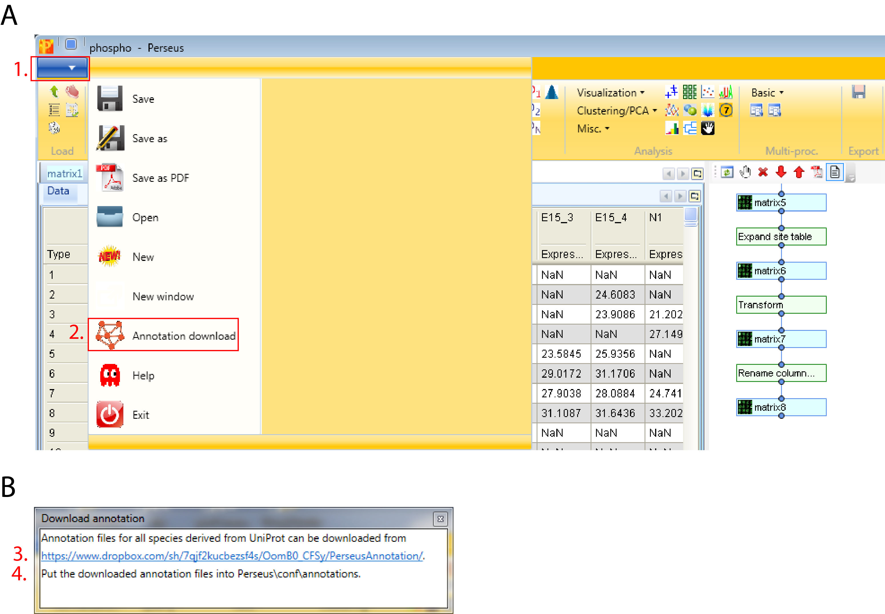
The standard way of obtaining the latest main annotation, containing: GO, KEGG, Pfam, GSEA, Keywords, CORUM and many other terms found in UniProt is by downloading the mainPerseusAnnot.txt.gz file from dropbox. This is an easy four step process:
- Click on the blue box with the white arrow on the top left corner of the Perseus window
- Select “Annotation download” and a pop-up window containing the dropbox link will appear
- Click on the dropbox link and download the mainPerseusAnnot.txt.gz file of your choice
- Put the downloaded file in the “Perseus/conf/annotations/” folder
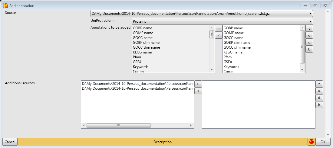
Since the data set is human, we have to download and use “mainAnnot.homo_sapiens.txt.gz” as “Source”. The mapping is always based on UniProt identifiers, therefore we have to specify which column contains the UniProt identifiers that should be used for mapping the annotation (parameter “Uniprot column”). Here the column “Proteins” contains the UniProt identifiers. Then we can select, which annotations should be added to the matrix. Here we select the list from “GOBP name” to “Corum” by clicking on them on the left hand side and using the button in the middle with the arrow to the right.
6 Add modifications
After adding protein specific annotations, we are now adding sequence specific annotations. Therefore we first have to download the files called “Kinase_Substrate_Dataset.gz” and “Phosphorylation_site_dataset.gz” from PhosphoSitePlus, unzip them and put them in the “Perseus/conf/PSP” folder. Now we can add the information to our identified sites.
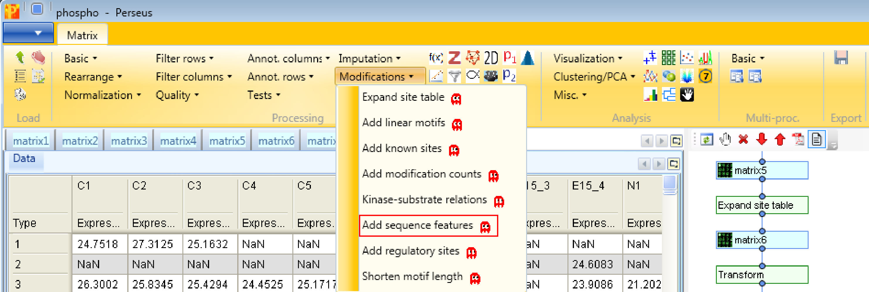
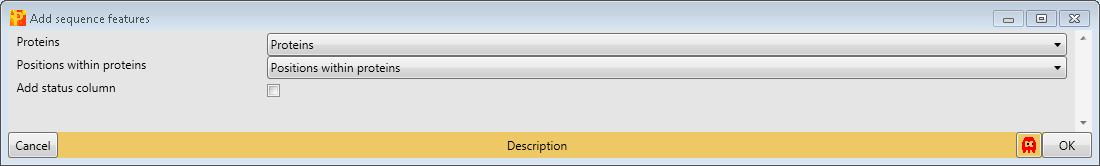
First, we add site-specific sequence features with Processing → Modifications → Add sequence features. Therefore we have to define the “Proteins” column containing the Uniprot identifiers and the position of the modification within proteins (“Position within protein”). This results in matrix with a lot of additional columns containing sequence specific information like zinc-finger region or signal peptide.
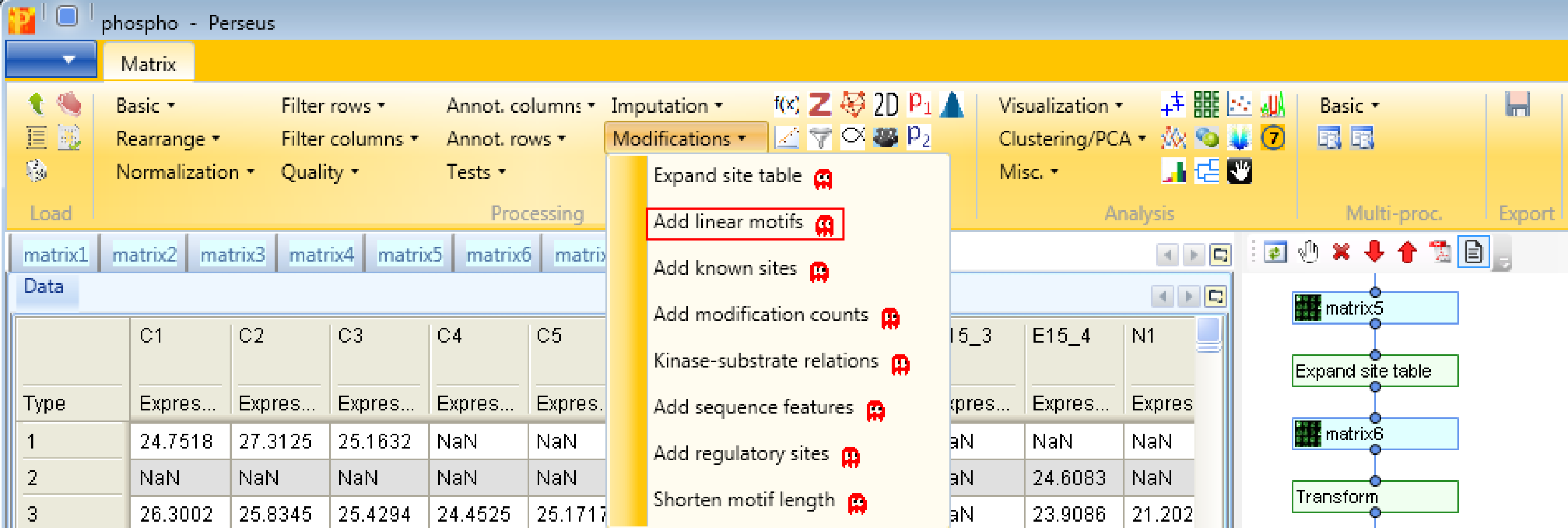
Second, we add linear motifs utilizing the Sequence window of the modification, which you can find in the text column called “Sequence window”. Hence we use the function Processing → Modifications → Add linear motifs. The results will be displayed in the column “Motifs” in the resulting matrix. The motifs derive from the “motifs.txt” file located in the “Perseus/conf” folder. In case you have additional motifs that should be searched in the identified sites, you can edit the “motifs.txt” file.

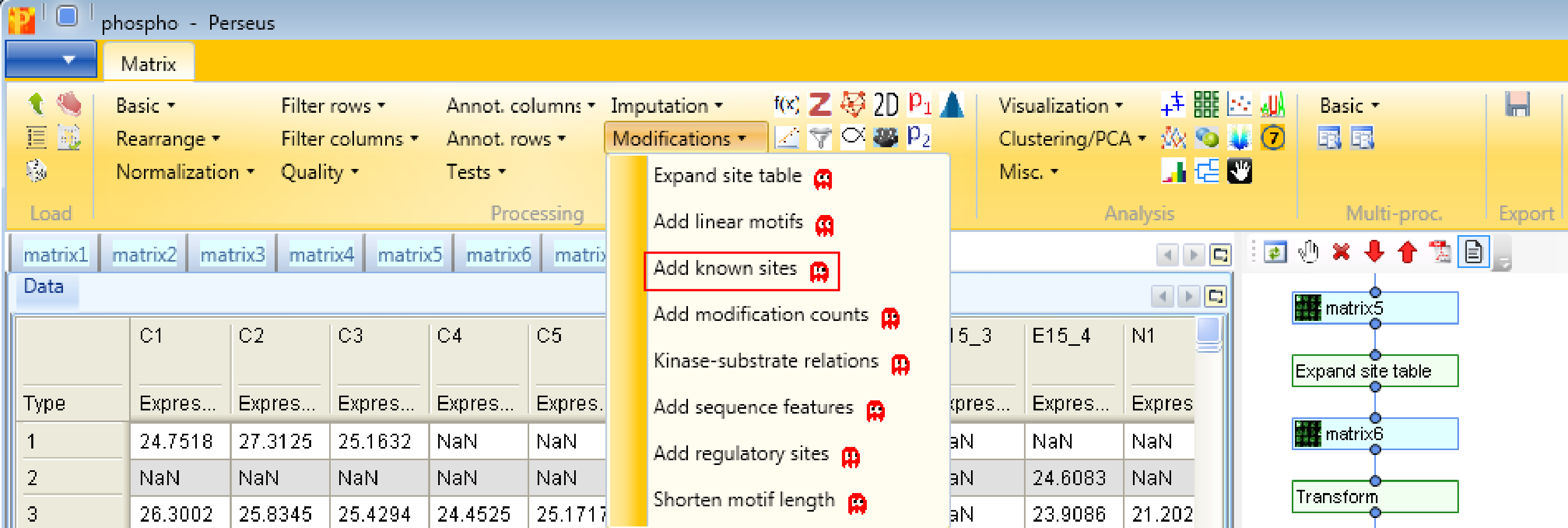
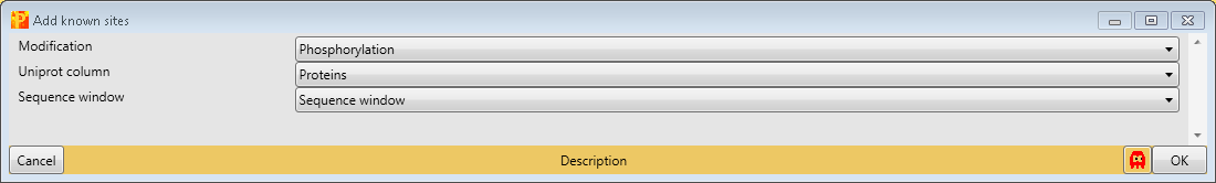
Third, we add known sites with Processing → Modifications → Add known sites. We are interested in phosphorylation and define them as “Modification”. Also we have to define the column, which contains the Uniprot identifier (“Uniprot column”) and the column containing the sequence window.
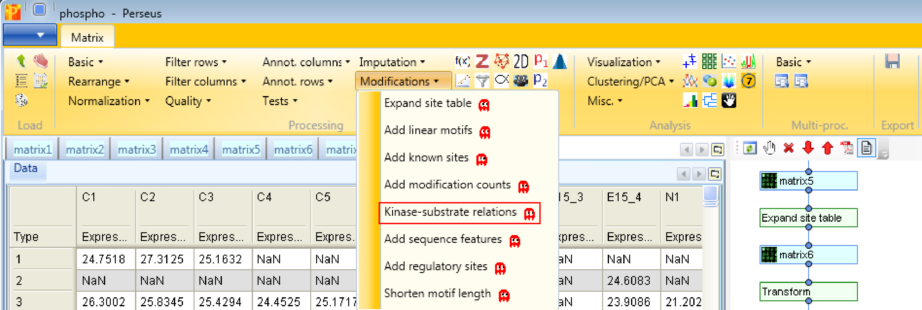
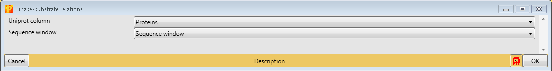
And last but not least, we add known kinase-substrate relations with the function Processing → Modifications → Kinase-substrate relations. For that we specify the column containing the Uniprot identifier (“Uniprot column”) and the one containing the sequence window.
7 Grouping of samples
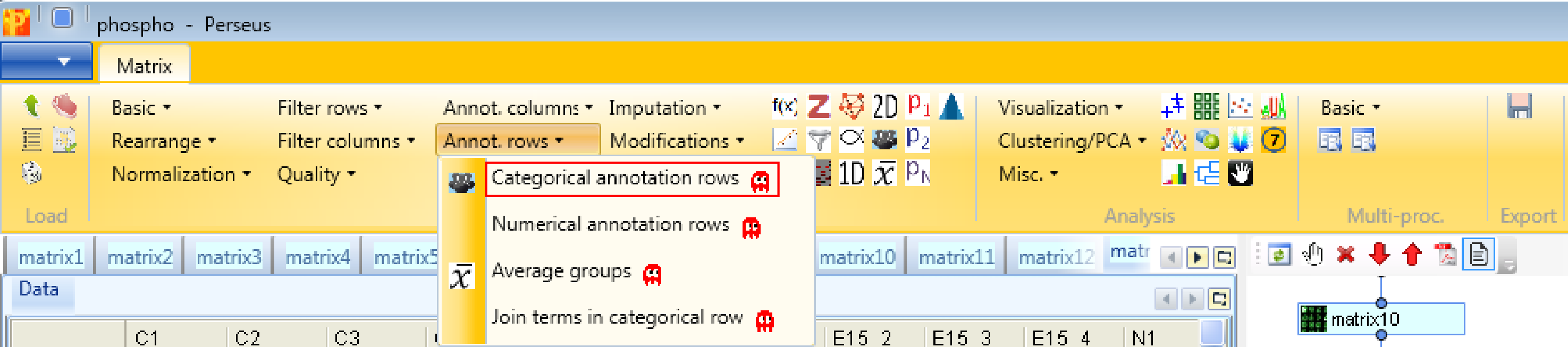
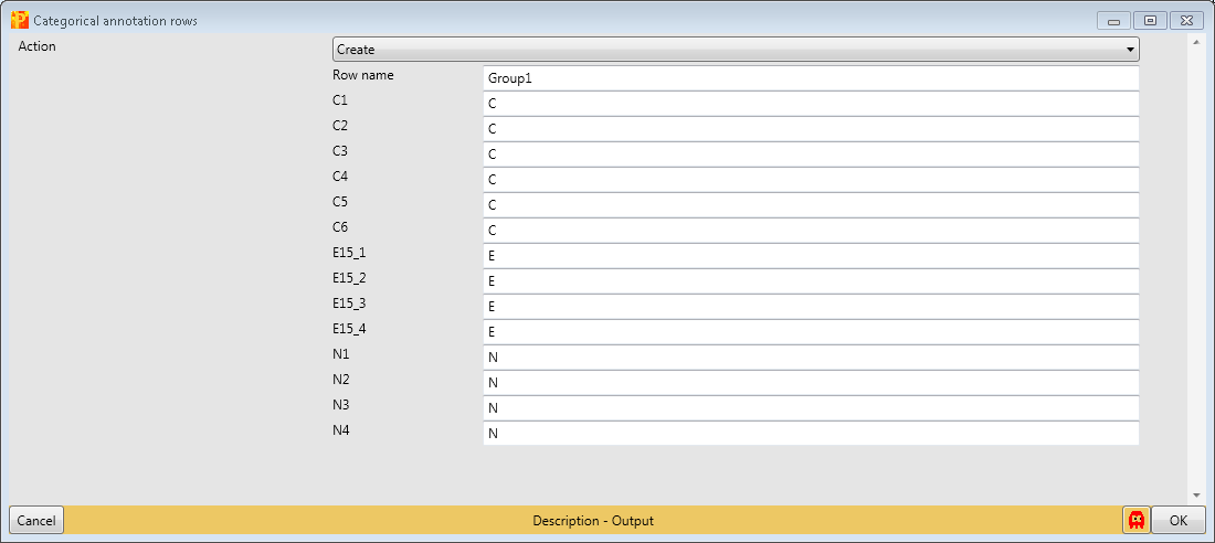
Define a sample grouping according to C, E15 and N using Processing → Annotation rows → Categorical annotation rows.
You can leave the name of the grouping to the default value “Group1” and just shorten the rest of the column names to the same prefix. Also giving each group a different name is possible, this is a matter of taste.
Also this is a good time to save a backup matrix Export → Generic matrix export.
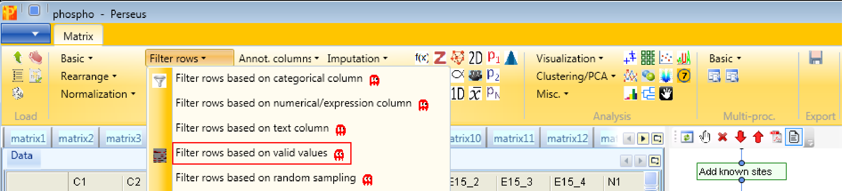
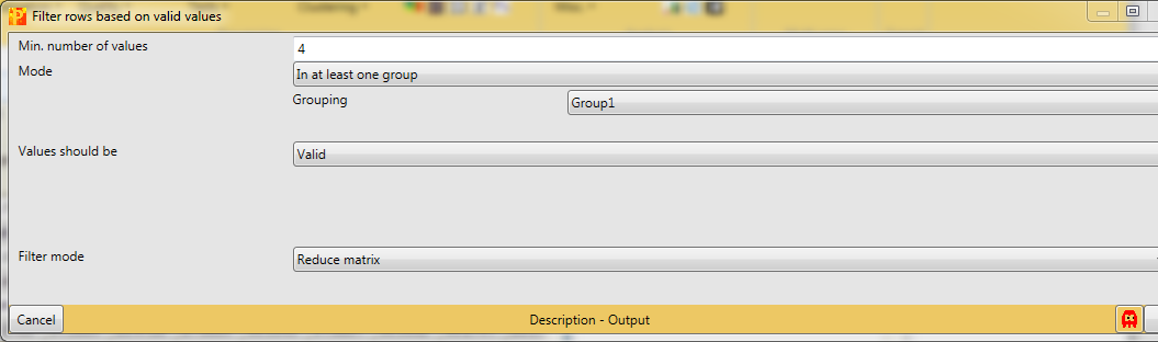
Next, rows without any valid values in the main columns won’t be particularly useful for quantitative analysis, therefore we can remove them by filtering Processing → Filter rows → Filter rows based on valid values.
There are different filtering strategies available. Think about what kind of valid value filtering makes most sense for this kind of data. Now that we have created sample grouping, we can take advantage of these groups for filtering purposes. So we want in at least one group 4 valid values. This makes particularly sense, because we are interested in the cases where one stimulus results in a lot of phospho sites in comparison to the control or the other stimulus.
And just as a comment, the fact that we have 4 replicas of each stimulus makes our filtering strategy quite strict and we are very certain about the identification after this filtering step.
Now the matrix is filtered, transformed, samples are grouped and everything is added that needed to be added, so we can examine the data by using different visualization tools.
8 Histogram
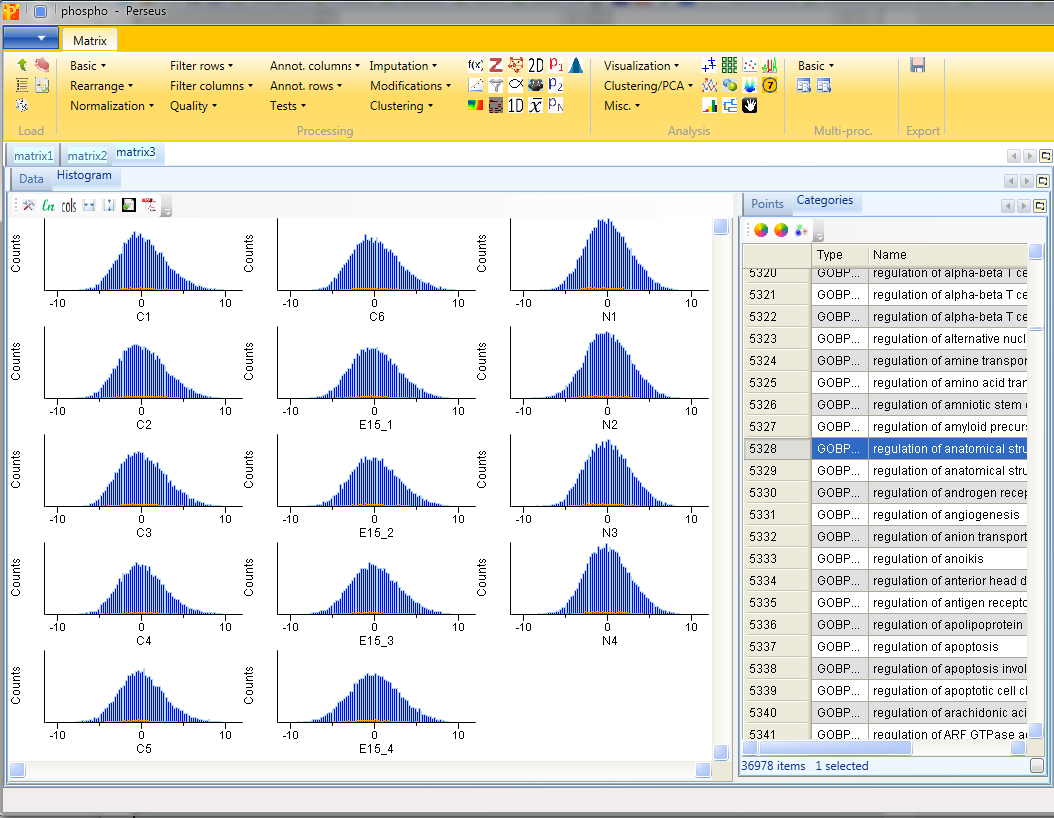
Now let’s look at some histograms of the data. Use Analysis → Visualization → Histogram.
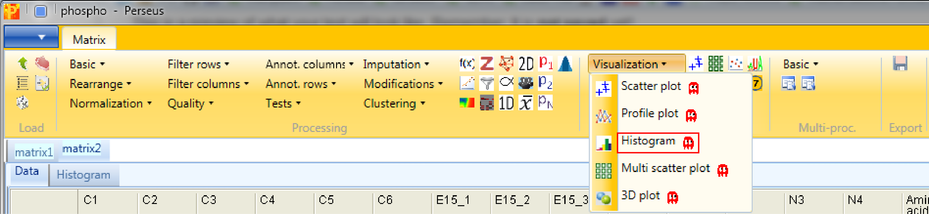
Each sample is separately represented by a histogram. Therefore, nothing needs to be changed in the parameters, because all main columns (samples) are selected by default. The results will be displayed in an extra tab on the same matrix containing the histogram functionalities.
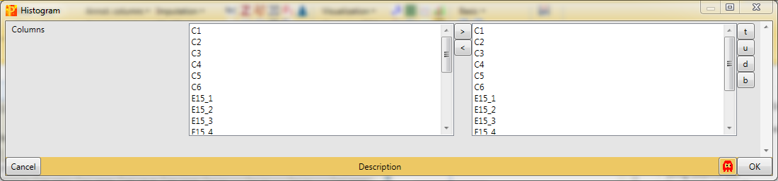
This can be useful to visualize the spread of the data and to determine, if the data might benefit from some normalization. Also histograms of sub-categories can be displayed by selecting one row (category) in the “Categories” table on the right side. Here the sub-category “anatomical structure morphogenesis” is highlighted in orange, but also individual points can be selected in the “Points” table to see where they are located in all histograms. In this case the data is well centered and does not need to be normalized.
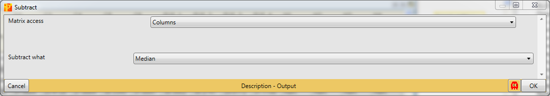
Nevertheless, for demonstration, you could subtract the median of each column with Processing → Normalization → Subtract.
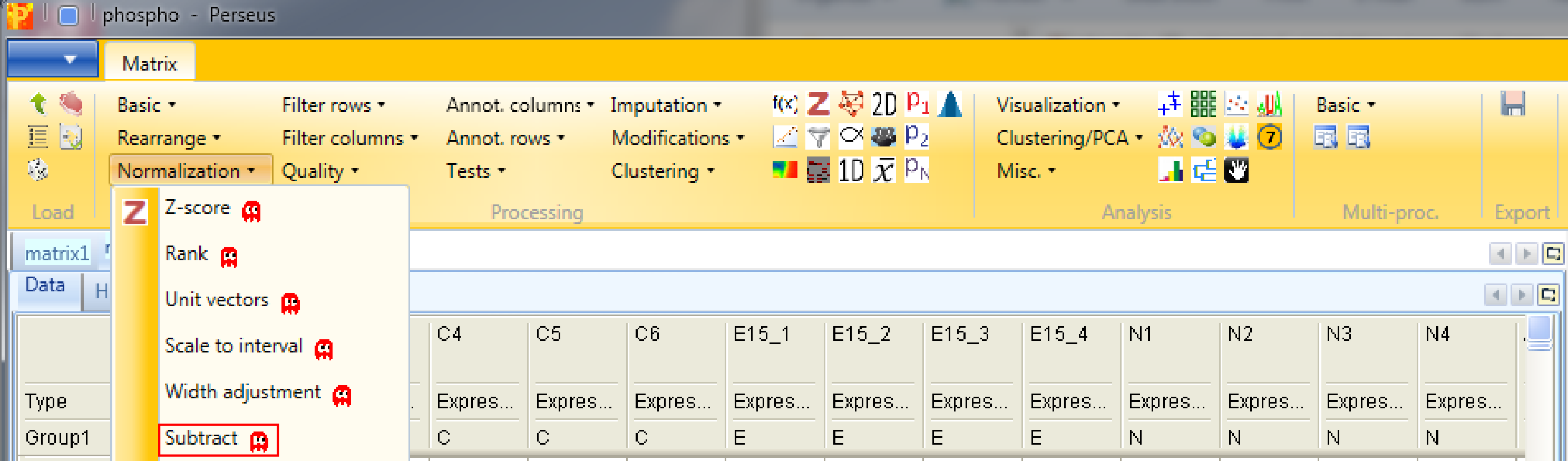
Set the parameter “Matrix access” to “Columns”.
And make new histograms afterwards to see the effect of normalization. Now the data is centered around 0.
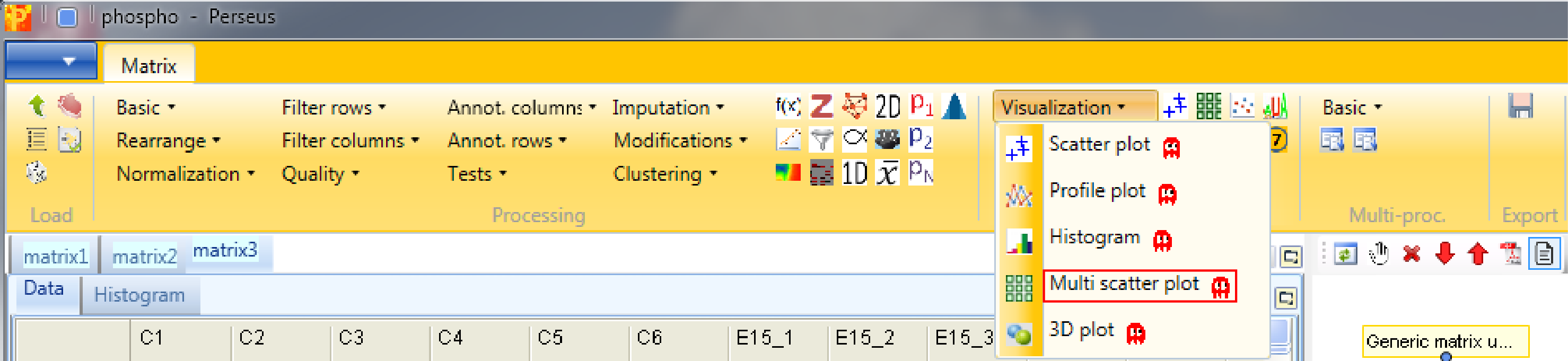
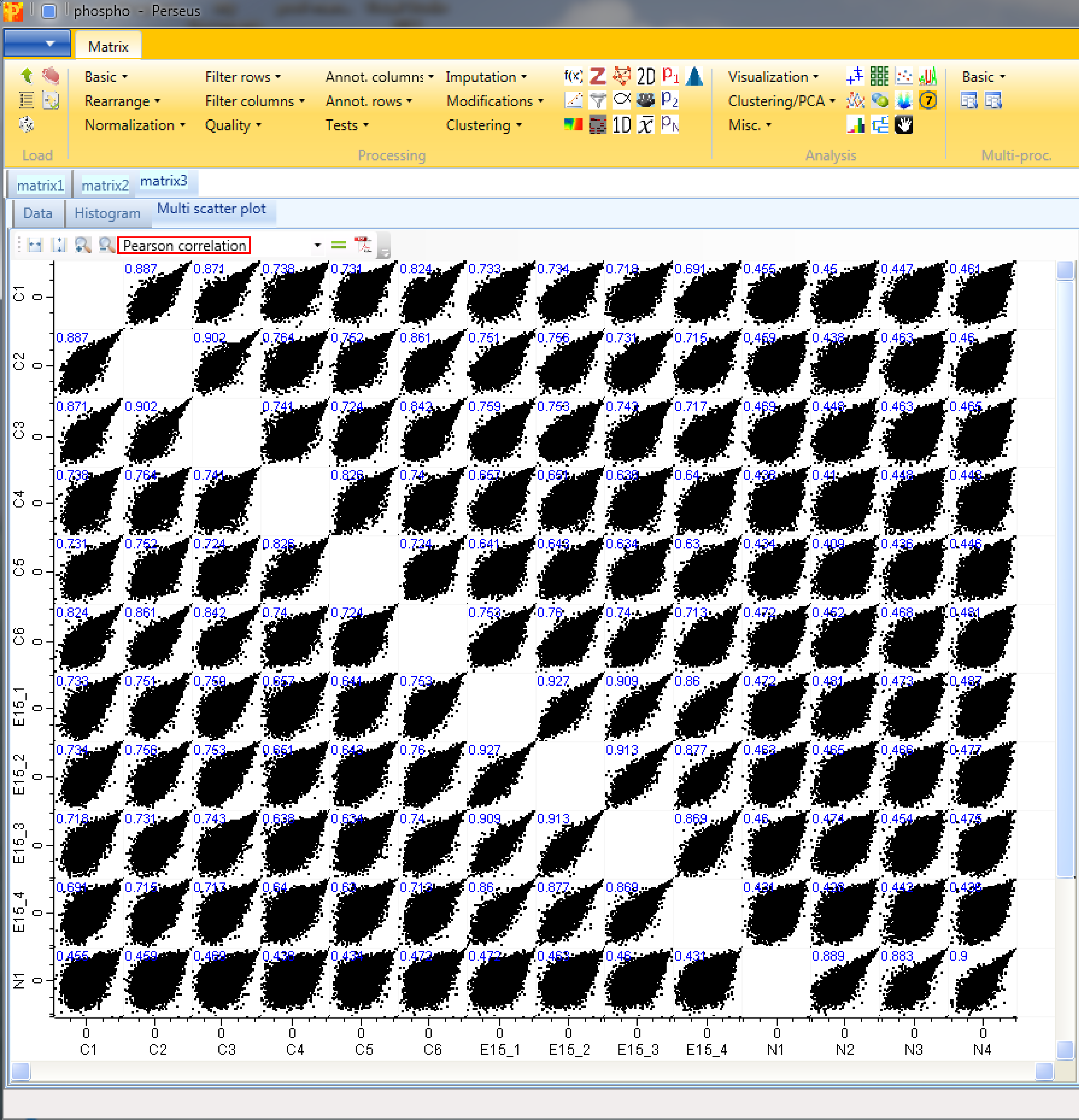
9 Multi scatter plot
Now open a scatter plot or a multi scatter plot to see, if you are happy with the correlation between replicates. Here we use a multi scatter plot Analysis → Visualization → Multi scatter plot, because it gives us a great overview in one figure. Also correlation coefficients can be calculated for each plot. Before you do this remind yourself that this is label free data, which may calibrate your expectations to low values.
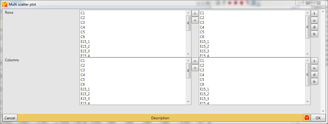
We want to plot all samples against each other. So no further changes are necessary, because all main columns are selected by default. The results will be displayed in an extra tab on the same matrix containing the multi scatter plot functionalities.
Now to figure out, which of the replicates have the best correlation we want to calculate the Pearson correlation (red rectangle) for every scatter plot. The results are written in blue on the left top corner of each scatter plot. Thus we can easily figure out, that replicate correlations are high and there are changes between control and the two treatments.
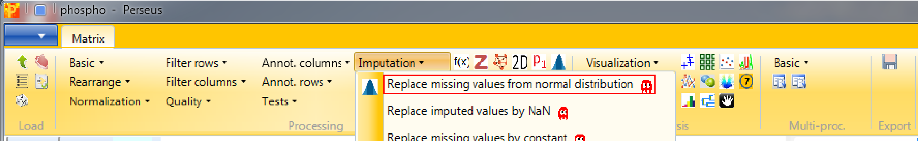
10 Imputation
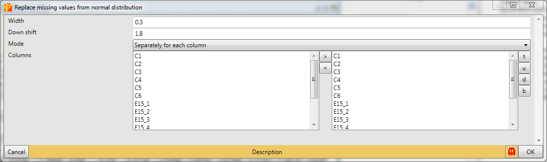
It is recommended to impute missing values after filtering, thus we don’t have any missing values in the data for further analyses. Therefore use Processing → Imputation → Replace missing values from normal distribution.
We want to replace missing values in all columns (replicates) separately, which are the default values. Also the default values for “Width” and “Down shift” are fine. To find the optimal values you can check different values for the “Down shift” and the “Width” parameter and view your results in the histograms.
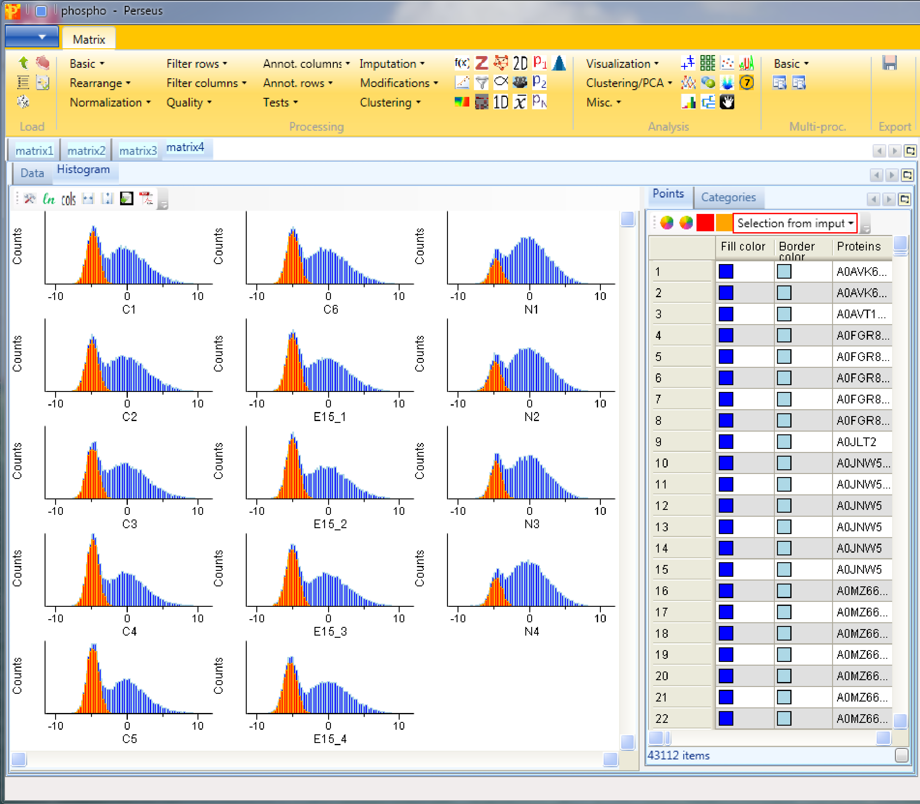
Plot a histogram using Analysis → Visualization → Histogram to view the results of the imputation. After selecting “Selection from imputation” in “Plots” tab of the “Histogram” tab (red rectangle), the imputed values are highlighted in orange in each histogram. We can see that these values are down shifted and their distribution is narrower, but their overall shape is the same one as the shape of the column we imputed. The assumption here is that the sites that we weren’t able to identify using the matching between runs algorithm are most likely low abundant in the sample and should therefore be on the lower end of the distribution.
11 ANOVA
To find sites that are changing between the three groups we perform an ANOVA test with Processing → Tests → Multiple samples. We select “Multiple-samples tests”, because there are more than two groups to compare. In case you wanted to compare only one or two samples you would use the respective t-test.

An important parameter in the parameter panel is “Use for truncation”. Here you can choose whether the truncation should be based on the p-values, if the Benjamini Hochberg correction for multiple hypothesis testing should be applied, or if a permutation-based FDR is calculated. As an example, if you select “Permutation-based FDR” and use 0.01 as a threshold value it would mean that there are 1% false positives among the proteins that the ANOVA test finds as significantly regulated.
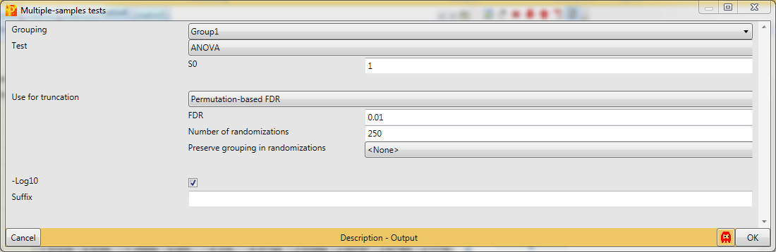
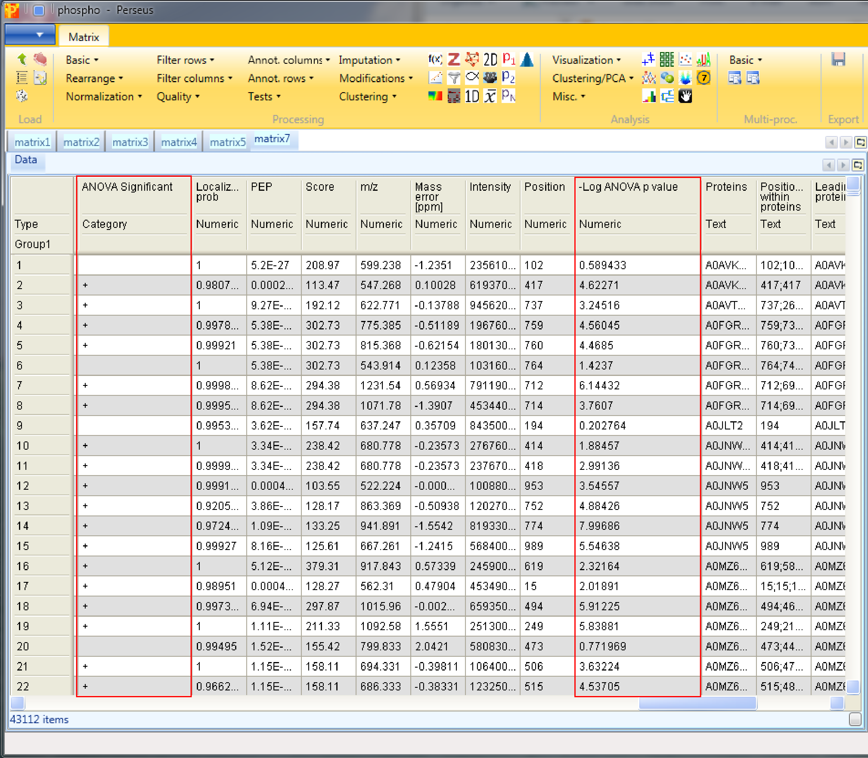
The resulting matrix contains two new columns, one categorical column called “ANOVA Significant” and one numerical column called “-Log ANOVA p value”.
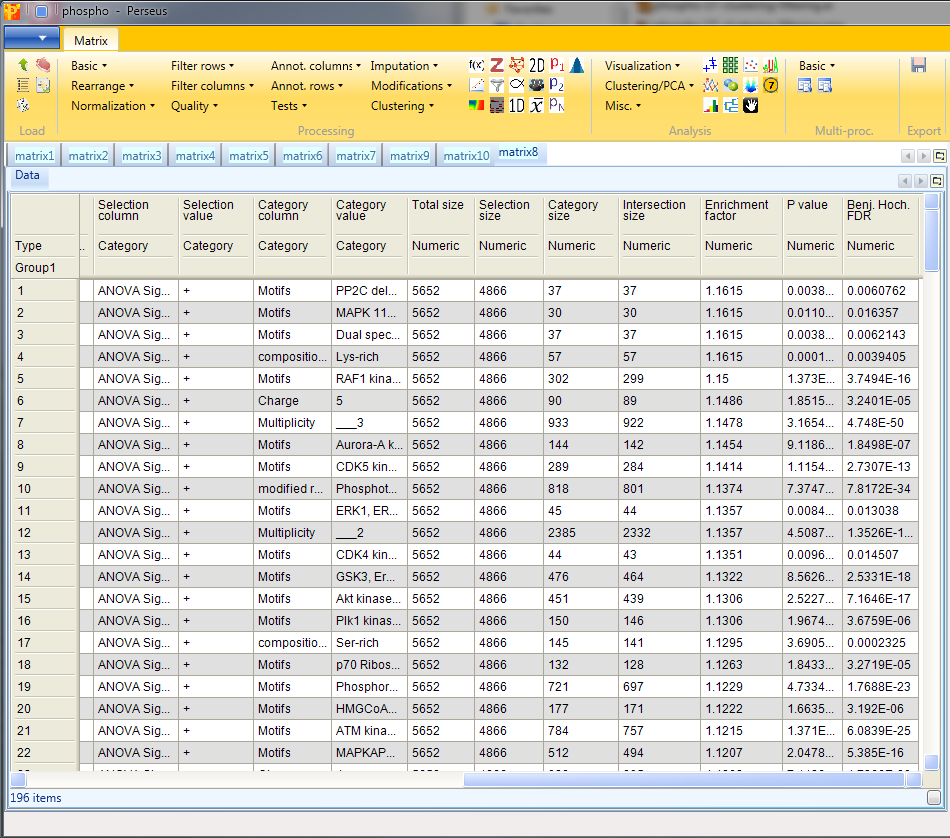
12 Enrichment, Fisher exact test
Now check which annotation terms are enriched in the changing sites. For this we use a Fisher exact test Processing → Annot. columns → Fisher exact test.
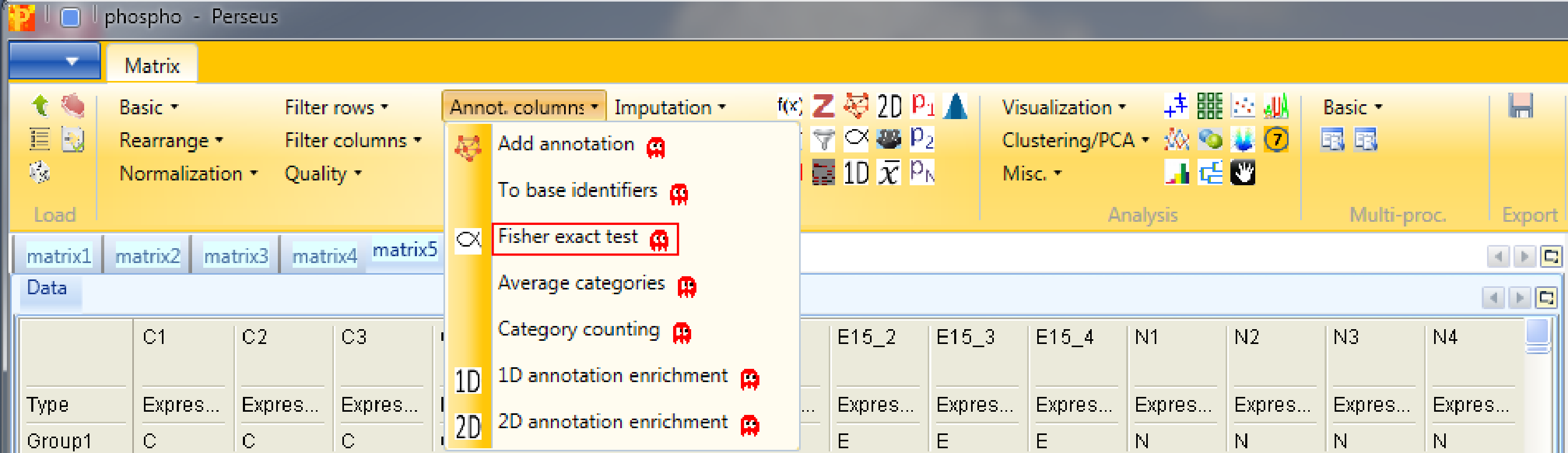
Select the “ANOVA significant” column. It is important here to select “Proteins” for the “Relative enrichment” parameter. It means that multiple sites on the same protein are counted only once in the enrichment calculations. This prevents an enrichment from becoming significant simply due to the presence of multiple phosphorylation sites on a single protein.
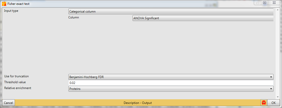
Results will depend both on the stringency in the ANOVA as well as the stringency of the Fisher exact test. The output matrix contains all the significant categories with their number of hits, enrichment factor, p-values, corrected p-values, etc. It might be interesting to try different combinations of these. You can also apply the Fisher exact test immediately on the numerical column containing the -log(p-value).
13 Hierarchical clustering
Next we want to explore the results, in particular look at enrichments of annotation terms in some clusters. So first we create a matrix with only the significant ANOVA sites using Processing → Filter rows → Filter rows based on categorical column.
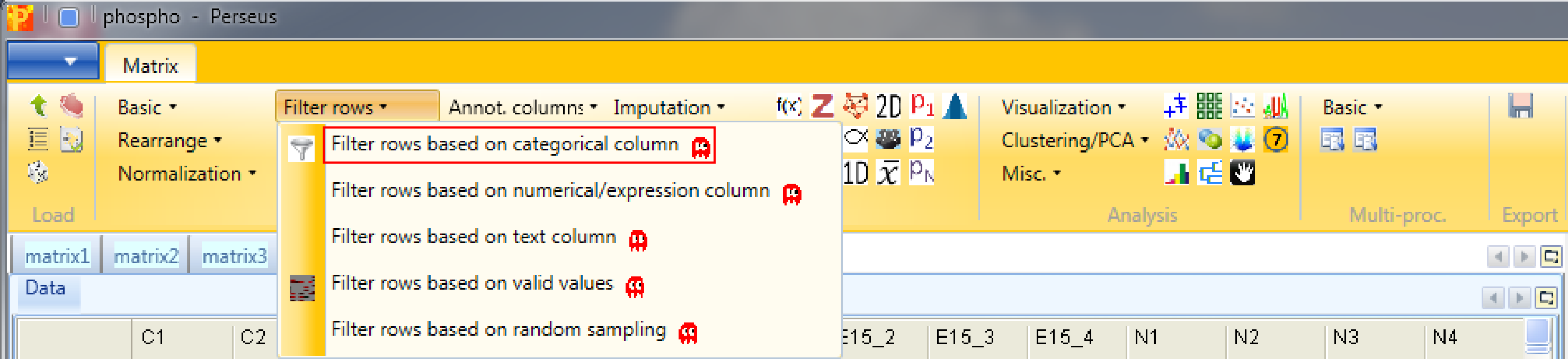
Significant ANOVA hits are indicated by a “+” in the “ANOVA Significant” column, so to retain these hits all rows containing a “+” will be kept. Therefore, the column “ANOVA Significant” needs to be selected, “+” is the value we are looking for and is selected by default. For the “Mode” parameter we have to select “Keep matching rows”. This results in a matrix, where the value in the “ANOVA Significant” column of all rows contain a “+”.
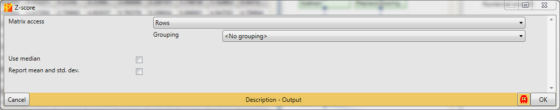
Second we are performing Z-scoring of rows with Processing → Normalization → Z-score.
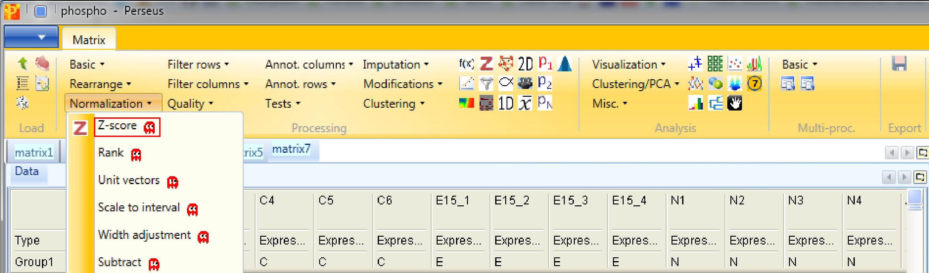
The default parameters are fine for the example shown here. This will shift the mean of each row to 0 and bring the standard deviation to 1.
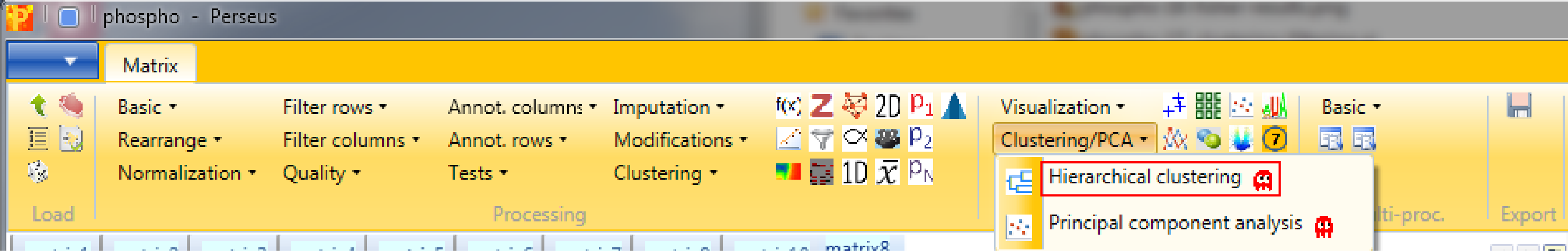
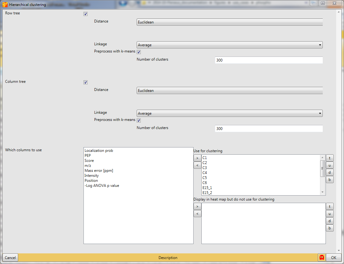
And finally we use hierarchical clustering Analysis → Clustering/PCA → Hierarchical clustering to visualize the cluster of the data.
with the default parameters, since the right columns are selected.
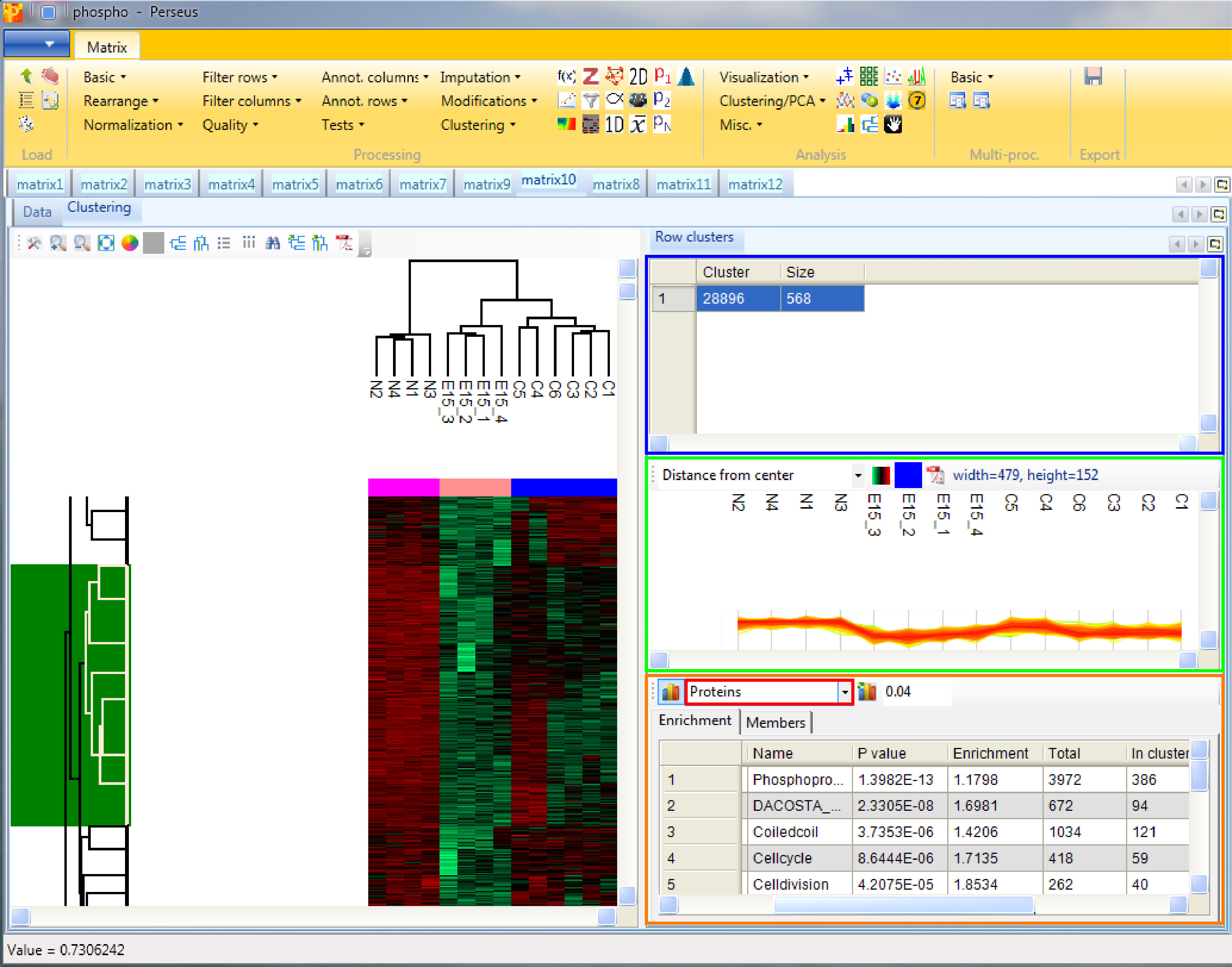
Considering the column tree, the control replicates as well as the replicates of each treatment cluster nicely together.

Considering the row tree, we have to zoom in by holding the left mouse key and dragging, to find a cluster of interest. To select a cluster click on the root of a sub tree and information about this cluster will be displayed in the windows next to the heatmap. The top right window contains the size of the cluster (blue rectangle). The window in the middle contains the profiles of the proteins within the cluster (green rectangle). And the window at the lower right enables enrichment analysis of the cluster by clicking on the button in the upper left corner of that window (orange rectangle). Since we analyze phospho data, which means we are interested in site specific enrichment, it is important that we use “Proteins” for the “Relative enrichment” parameter (red rectangle in the orange box). It means that multiple sites on the same protein are counted only once in the enrichment calculations. This prevents an enrichment from becoming significant simply due to the presence of multiple phosphorylation sites on a single protein.
There are many more ways to further explore the data. If you have time try e.g. Analysis → Clustering/PCA → Principal component analysis. Note that principal component analysis is best done without prior z-scoring of the data.